Templates and page layout instructions
Template training/refresher video
This 1h25 video is for designers who need training or a refresher on how to do templates for DK.
Should you need to refer back to a particular section, here is where each one starts:
0:00 Intro
2:52 Documents to be supplied for checking
6:49 Document set-up
30:02 Images, colour & objects
43:45 Text styling
1:20:48 Final checks
Understanding Style Sheets etc. training/refresher video
This 1h03 video is for editors who need training or a refresher on how to work with DK style sheets. This video also includes other useful information, tips and shortcuts.
Should you need to refer back to a particular section, here is where each one starts:
0:00 Intro
1:27 Fonts
5:02 File set-up
6:37 Style sheets
29:50 Object styles
33:53 Overprint
35:56 Co-edition
40:03 Fractions
44:06 Masters
49:16 Baseline grids, linked boxes
52:00 Overset text, shortcuts
58:12 Workspace
1:00:17 DK Handbook links
The following instructions have been written for designers to understand the technical requirements of our layouts so that they are print ready. Failure to follow these page layout instructions could result in problems on press for ourselves and our co-edition partners.
The template checklist
While SourceReport will flag most technical issues, it will not flag the most efficient way of creating a template. This checklist will help you do this. Please download it here:
Size
Pages should be set-up to the exact trimmed page size as advised by Production.
Document set-up
Please note that all DK books, covers, endpapers, etc. should be laid out using Adobe InDesign.
Templates should always be set-up from a brand new InDesign file rather than from existing spreads to avoid bringing in old preferences and settings which could corrupt the new template.
The template should ideally be one document which includes the different types of spreads that the book will consist of. (There is no need to include the same type of page and styling more than once in the same template). Only spreads which require different baseline grids should be set up as separate template files.
When saving your template, go to Save as… and select Format: InDesign (current version) template (.indt).
When creating live spreads, ensure that you do not put too many in one InDesign document. This could cause issues, such as files being too big to work with, corruption or problems when archiving the book, or making corrections to the book after archive. It can also restrict the number of people working on the same book. (We recommend 10 spreads maximum in one document).
Links
The template should only contain re-occurring links that will be used in the book as these will need to be checked by Production Editors. Sample links should not be included. Information regarding file naming and authorised formats, can be found here.
Style sheets
The text used in the template should not be live text. Lorem Ipsem should be used instead and all text should be assigned a Paragraph/Character style.
We recommend not to go below 6 pt in text size, particularly for reversed out text (except for the FSC pledge which was purposely created smaller), to ensure text shows up correctly on press. Bear in mind that our printers will not flag if text has been created smaller than 6 pt.
Each style sheet should be numerically prefixed in order to reflect as closely as possible the typographical hierarchy of the page, and use only legal characters found in our standard file naming guidelines. See example below:
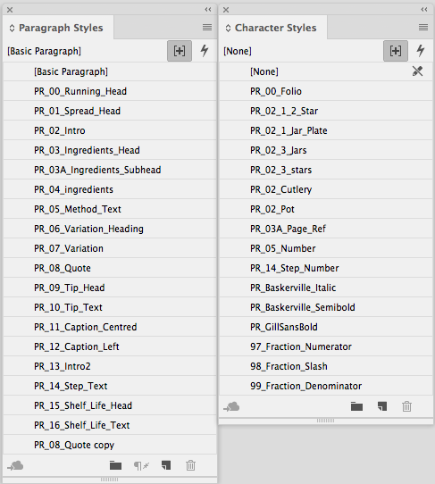
Paragraph Styles
Paragraph style sheets should be defined and applied to all text throughout the book and remain unmodified, ie. no “+” symbol next to the paragraph style in the paragraph palette (except for essential tracking and excessive sizing).
- Paragraph styles containing black must be set to overprint.
(PARAGRAPH STYLE OPTIONS > CHARACTER COLOUR > [BLACK] OVERPRINT FILL = ON). - Hyphenation should be set to ‘off’ and as a default for all style sheets
(PARAGRAPH STYLE OPTIONS > HYPHENATION > HYPHENATE = OFF). - Use ‘Adobe Single-Line Composer’ as the default for justification options
(PARAGRAPH STYLE OPTIONS > JUSTIFICATION/COMPOSER). - When working on the UK version of a book, the Language should be set to English: UK. When working on the US version, it should be set to: English: USA.
PARAGRAPH STYLE OPTIONS > ADVANCED CHARACTER FORMATS > LANGUAGE. - The Basic Paragraph style should not be used or based on by other styles, as it can cause problems if text is copied between documents where “Basic Paragraph” is defined differently. In any case, this should be set up using one of the fonts used in the book to avoid System fonts creeping in.
- Rules above/below should also be set to overprint.
Character Styles
Character styles should also remain unmodified and carry the same number as their respective paragraph styles. They should only be used where in-line style changes are required. Some character styles such as italics or bolds which can be used for more than one paragraph style do not need to be numbered (make sure you do not specify point size or leading).
Fractionizer character styles (97, 98, 99) are included automatically when running the script. Do not rename them or change their font. Only tracking can be tweaked within those styles.
Tip: You will see from the above example that the initials of the book (PR) were added at the beginning of each style sheet name. This helps to control unwanted imported style sheets from other books after the template stage.
Object Styles
Object styles may be used where practical to automate repetitive styling treatments (e.g. curved boxes, weight or style of rules, text wraps, etc.)
Margins & layouts and Parent page (masters) elements
- Ensure that document pages are based on their respective Parent page (do not modify Margins and Layouts on the document page, do this on the Parent page).
- Check all Parent page elements align exactly on left and right hand pages.
Gutter line for DK Knowledge titles only (these are now available automatically when outputting to PDF or JPEG using Exporter so, no need to add them to the template but this is how they are set up):
- Ensure your stroke alignment is set to Align Stroke to Centre in the Stroke palette.
- Create a 4mm (11.339pt) stroke coloured Black 20% (no fill) on the Master(s), on the UK layer only, in the centre of your spread.
- In Attributes, set it to Overprint Stroke and to Nonprinting.
- When printing the spread with the gutter line showing, make sure the Print Non-printing Objects box is checked in the Print dialog box (uncheck this if you want to print without that line showing) as well as the Simulate Overprint option under Output of the same print dialog box.
- When outputting Review PDFs for approval, if you want to show the gutter line, make sure the Non-Printing Objects box is checked in the PDF dialog box.
Example of the gutter line in place:
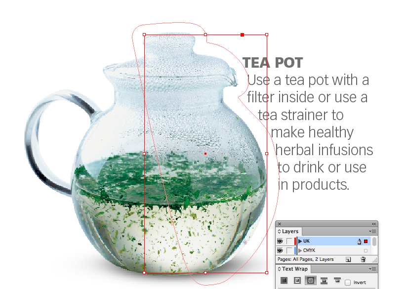
Co-edition Layering
- There should only usually be 2 layers in your co-edition file (more if including print finishes such as Cutter Guides) for co-edition titles:
- Colour layer named “CMYK” containing images and objects common to all co-edition languages. This layer should be locked when colour elements are final.
- Translation layer named “UK” or “US”, placed on top, which contains text and elements common only to a particular language. Do not lock that layer for ease of editing.
- The text layer must only contain objects that are coloured black (K only) and all elements placed on this layer should be set to overprint. (Please note that as we need to be able to extract text for various reasons (e.g. eBooks, etc.), all titles will need to be set up with editable text directly in InDesign, text PDFs placed in InDesign will not be accepted).
- Please keep the layer colour the same as on the screengrab above to retain consistency across all our books.
- For non co-edition titles, keep layer naming descriptive (i.e. text, graphics, finishes) and remove unused and unnecessary layers. In InDesign, the ‘Paste Remembers Layers’ option should always be turned ON (InDesign Layers Palette > Paste Remember Layers) so that when copying items from one page or a document to another, items are automatically placed on the correct layer.
Bleed and slug
- 5mm bleed all round inside pages (with a 30mm slug in special cases only, e.g. gatefolds, but check with production editor).
- 15mm bleed all round for jackets.
- Ensure all elements extend to full bleed. Please note that the printer will not flag if any elements do not have sufficient bleed.
- Bleed set to 5mm all round to allow for format reductions at the Printer (i.e. minimum bleed allowances of 3mm will be maintained if the format is reduced).
- For wiros, ask production to check with the printer for their required specifications, as you may have to add extra bleed in the gutter.
Text and object area
All text and objects which do not require bleed, should be positioned a minimum of 6mm from the trim area. This is not only to avoid ink being too close to the trimmed edge but also to avoid an uneven look if the trim is slightly off perfect. Please note that the printer will not flag if any elements are placed less than the 6mm minimum from the trim.
Text wraps
Due to the way we work with co-editions partners, we need to ensure that any text wrap shapes are separate from images. The way our text wraps are created may not suit translated text and they may need to be altered. Because of this, all text wraps should therefore be placed on the translation layer and their content set to Unassigned (Not Text).
Folios, numbering and sections
- Folios must use the auto page numbering command wherever possible. Place the text cursor in a box on the master page. In the menu bar go to Type > Insert Special Character > Markers > Current Page Number, to insert the ‘auto page number’ on to the master page. All pages linked to this master will be numbered.
- Test folios with 2 or 3 digits to make sure they fit.
- Text boxes containing folios or running heads should have the Ignore Text Wrap feature (Object > Text Frame Options > [Ignore Text Wrap])
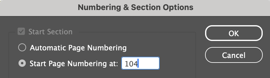
- Ensure that Section Prefix and Section Marker are both left blank within the Numbering and Section Options of the Page dialogue box (except for Novelty books which may need special section prefixes).
- The Start Section should be set up as on this screengrab:
Rule weights
Minimum and recommended weights
| Rule | Minimum | Recommended |
|---|---|---|
| Black (100% K only) | 0.2 pt | 0.3 pt |
| Reversed out of CMYK (4-colour) | 0.3 pt | 0.5 pt |
| Grey (% tint of K) | 0.3 pt | 0.5 pt |
| CMYK (4-colour) | 0.3 pt | 0.5 pt |
Swatch tints and Registration
- It is recommend that no swatch colours CMYK breakdown, be below 2% of any single ink and 5% in total (example Cyan at 2% and Magenta at 3%), especially when using a swatch tint percentage. Please note, our print suppliers cannot guarantee the consistency of ink percentages below 6% across a print run and minor colour shifts may occur.
- Maximum CMYK breakdown for a swatch should not exceed the TAC levels (ink weight total) for the chosen colour management setting.
- The Registration colour swatch should never be used. InDesign automatically uses registration for page trim marks and even though its available to use in the swatch palette, we recommend it is never used to colour text, images or objects. Please take care not to use a White swatch. The Paper swatch should be used instead.
Transparency Blending modes in InDesign
- Do not use any blend mode other than Normal on the text layer unless the text sits on a white background. Any blend mode can be used on the CMYK layer.
Libraries
Libraries are used for repetitive object placement on multiple spreads. They should not be supplied with templates but should be created after the template has been approved, unless they contain colour master elements.
To create a new library, go to the menubar FILE > NEW > LIBRARY.
- When building page item libraries, objects should be pre-assigned to the standard layers so that when the library item is dragged to a page in progress, the relevant components of the library item will be automatically assigned to the correct layer but ensure that Paste Remember Layers has been turned on in the Layers palette first.
- All text within library items must be styled using style sheets as per the standard specifications prior to inclusion in the library.
- The exact position on the page of a library item at the time it was first added to the library is remembered by InDesign. To place the item from the library onto a page to the exact same co-ordinates as the original, use the ‘Place Item(s)’ command from the Library pop-up menu.
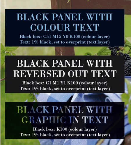
Co-edition text effects / reversed out text in InDesign
- Various effects can be achieved by using a combination of CMYK in the black area of an image/box to affect text colour while retaining co-editionability, as shown in the image below.
- In the first example, the CMY amounts in the black panel contain the text colour. The text knocks out the black in the panel to leave the remaining colour in the text.
- In the second example, the 1% in the CMY separations knocks out the image completely under the black panel. The text knocks out the black in the panel.
- In the third example, there is no CMY in the black panel so it overprints the underlying image. The text knocks out the black to show the image through the text.
Handling titles with mixed trim sizes (TPS) for eBook conversion
Reflowable eBooks: For titles being converted to reflowable ePubs, the dynamic reflow of text and images to fit any screen size and ratio means the physical dimensions (TPS) of the print source files are irrelevant. Therefore, creating separate InDesign files at different sizes is unnecessary. Even with print files having mixed TPS (e.g., shrink-down editions), a consistent TPS across the source files is not required for reflowable ePub conversion.
Fixed Layout eBooks: In contrast, converting titles to Fixed Layout ePubs necessitates a complete set of print files set to the exact same TPS. This is because eBook reading applications do not support varying page dimensions within a single Fixed Layout ePub.
If you are unsure whether a title is being converted into a Fixed Layout ePub or not, please reach out to the Digital Programme Manager for confirmation.