Mono images
Overview
This is a recommendation for all mono images
- Convert all colour images to Grayscale or Bitmap using Photoshop
- Photographs in grayscale have a tint range of 5% and 80% for mono text papers, 3% and 97% for coated papers
- Line art images can be either grayscale or bitmap, depending on resolution and quality, tint range 0% to 100% on all papers
- Pre-printed grayscale images should be descreened, to remove halftone dots
- Text and line art can remain solid black, except where larger areas of solid ink occur
- White areas can remain deliberately 0%, i.e. cutouts
- Tint panels should have minimum 10% difference between each other for definition
- Halftone screening is more course on text paper (150lpi)
Types of image
Mono printing as the name suggests, uses one colour ink for printing (usually black) in inset or integrated mono text pages. The reduction to a single ink means that the density of the black is much less than in 4 colour process printing. Colour images with multiple channels (for example RGB or CMYK), must be converted to a single channel (such as Grayscale or Bitmap), and should be high resolution with good tonal range.
- Images integrated in text pages should have a tonal range between 5% to 80% to compensate for high dot gain in the heavier inked regions on press and paper absorbency properties. Over 80-80% and areas become solid black, under 5-7% and areas become white. Images inset on to separate stock are usually printed on coated paper and can have a 3% to 97% range. Failure to follow these recommendations could result in poor print reproduction.
Grayscale or Bitmap?
Mono images come in 2 flavours, each with advantages and disadvantages.
Grayscale images have pixels with shades or levels of black from 0 to 100% and are ideal for conversion of colour photographs and some line art drawings. Bitmap images have just 2 levels, 0 for white and 1 for black. They are suitable for graphics, line art, icons, logos and signatures. Bitmap should be used over Grayscale when an image has little or no natural shades of tone, but will require different setup to Grayscale (see resolution). Bitmap is also ideal for print finish designs as long as the resolution is high enough.
Converting
Images have to be converted to single channel/colour. Converting an RGB or CMYK Colour image to Grayscale or Bitmap ready for mono printing, can be done using Photoshops menubar at the top of the screen and its options within.
![]()
Convert images for mono use;
IMAGE > IMAGE MODE > GRAYSCALE or BITMAP
This will perminantly remove all colour information from the image, and reproduce a grayscale (black only) or bitmap equivalent.
- Bitmap option only becomes available when the image has been turned to Grayscale first
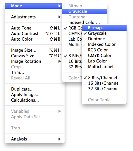
Image Quality
Use Adobe Bridge to check image properties and resolution.
Once converted to Grayscale, an image should be assessed for quality by checking and adjusting its resolution quality so that it’s at print size when imported in to InDesign page layouts. If the image at print size is too small to fit the page, you may want to resize and sharpen the image to improve or find an alternative.
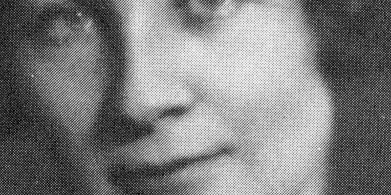
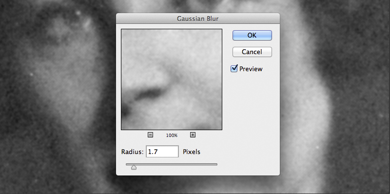
Descreen
Some images may have been scanned from printed copies (for example the image above), and will require descreening to remove the potential for printed halftone screen clash that could ruin a good image. Descreening, is basically merging the halftone print dots back until they are invisible, which can be achieved using blurring. Blur can be done best using the Gaussian Blur option in Photoshop. Adjust the blur level until the dots disappear but the detail is still retained.
FILTER > BLUR > GAUSSIAN BLUR
Assessment of image quality
We recommend the Info and Histogram palettes as the best tools to use when judging if an image needs to be corrected. Look at these palettes while adjusting an image and see the changes.
- In Photoshop press just the F key to cycle through display full screen mode and the TAB key to hide and show all open palettes.
You can access the Info and Histogram palettes from the menubar in photoshop:
WINDOW > INFO or WINDOW > HISTOGRAM
Info palette
Displays tint values of a pixel under the pointer, choose K (black) for one of them (click the small eyedropper icon to choose).
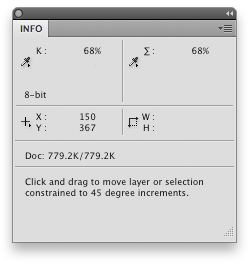
When making an adjustment, the Info palette will display before (left) and after (right) values.

For a more consistant reading, select the eyedropper tool from the tools panel and change the ‘sample size’ setting at the top of the screen to at least ‘5 by 5 Average’.
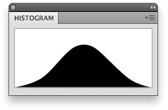
Histogram palette
Shows the spread tonal values within the image.
An average image will have a bell shaped histogram tapering off at each end that indicates good tonal range. Too much space at each end represents a flat, washed out image with no real black or white areas. A cliff face at either end represents data has been clipped, and a loss of detail in the image.
- Be careful not to read cut-out images as these give false reading because of the large amounts of white area.
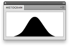
Ideal image
A good range of tonal data throughout the image, full midtones (centre) and both shadows (left) and highlights (right) tapering off. The maximum black and white points are circled.
Too flat
All the image data is still there but the spaces either side mean the lightest and darkest points of the image are not near what they could be and should be stretched.
Too light
The lightest part of the image is too close to the maximum white point and data (detail) has been clipped (lost). The spike on the far right indicates a significant number of pixels being white, far more than would normally appear in a typical photograph.
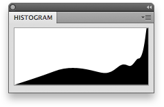
When adjusting an image, look at the info and histogram palettes to see how you are affecting the image. If the histogram edges are just touching the left and right sides of the box, then you are getting the best of an image.
Sharpening, contrast and detail
Due to the weakening density properties of mono text paper, many grayscale images may look flat, ‘soft’ and lacking in detail. We recommend that grayscale images can be retouched using the tools shown below in Photoshop. Remember to use the Histogram tool to check that detail is not being lost during retouching.
For the best results, before adjusting images, make a duplicate layer and use a mask to apply your retouching to specific regions needing adjustment.
IMAGE > ADJUSTMENTS > SHADOW/HIGHLIGHTS…
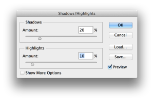
Use the Shadows slider to lighten detail in dark areas of an image, and the the Highlights slider to make light detail appear darker. This is very useful for adjusting line art, and adjusting heavy grayscale ink areas.
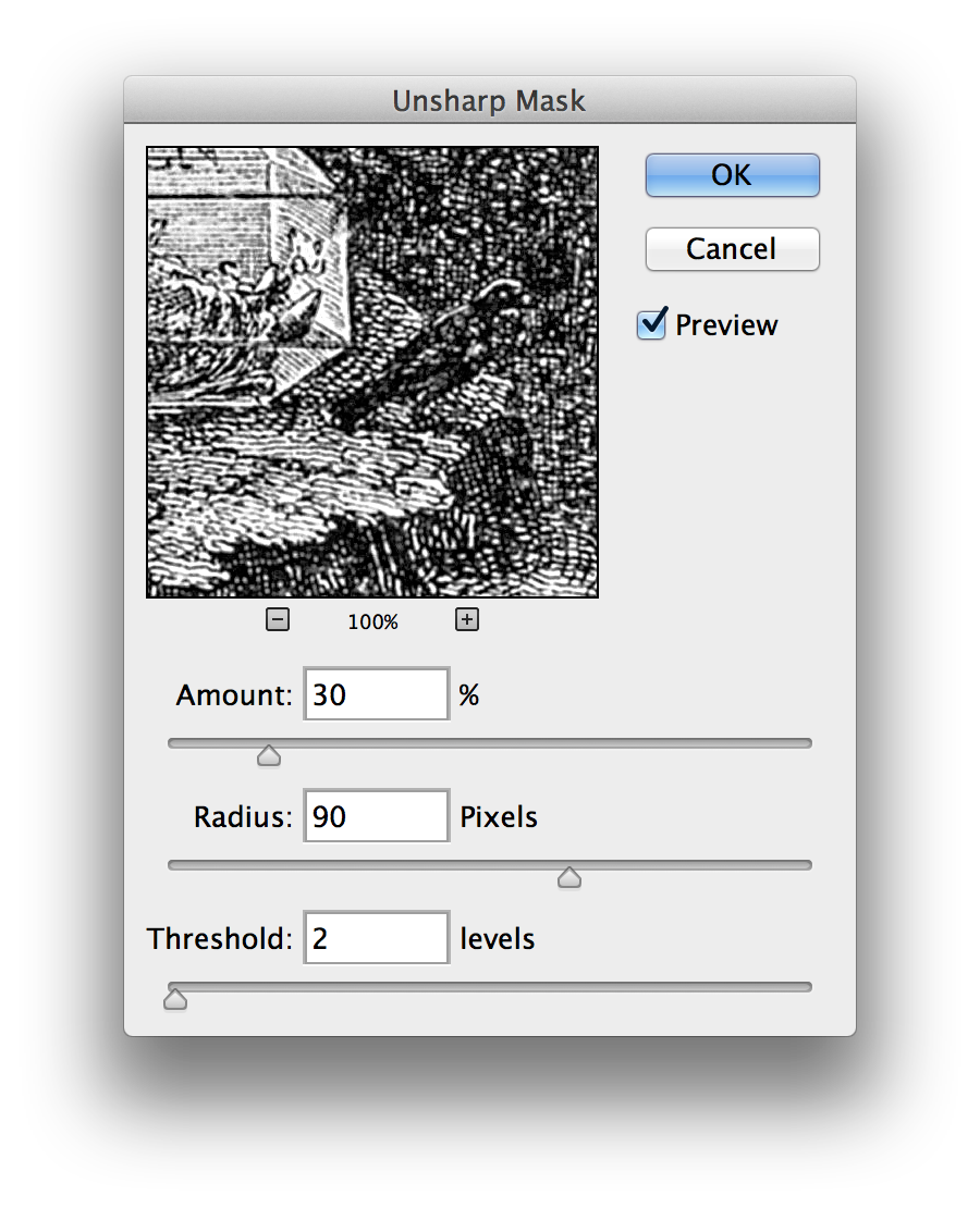
FILTER > SHARPEN > UNSHARPEN MASK…
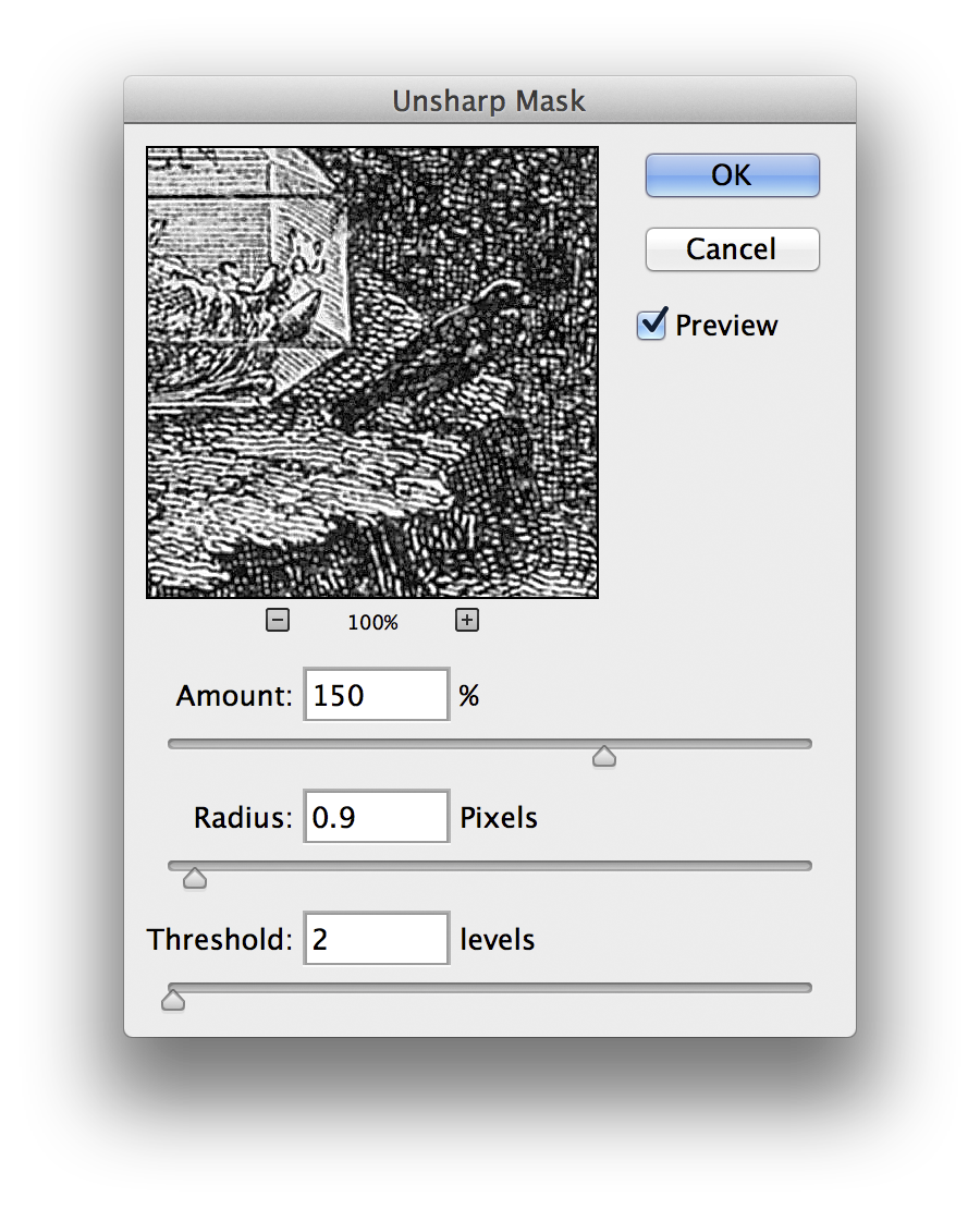
For sharper detail use a high Amount (50-200%) and low Radius (0.5-1.5 pixels), Threshold between 0 and 5
For more contrast use a low Amount (20-80%) and high Radius (70-140 pixels), Threshold between 0 and 5